Having worked on a project for some time around gender pronouns, it became evident that there was no universal symbol or icon to represent the concept of a pronoun.
The only icon that came up in online search results was the abbreviation “Pron” with a block of background colour. This is an abbreviation of an an English word.
With an increasing number of apps and services starting to incorporate pronouns in profile options, creating a supporting symbol seemed appropriate. The abbreviation “Pron” is language-specific and wouldn’t work well internationally.
I tasked myself to come up with an abstract symbol that can represent pronouns in a universal way. However, it had be flexible enough to showcase the diversity and full range of pronoun usage.
The Pronoun Icon
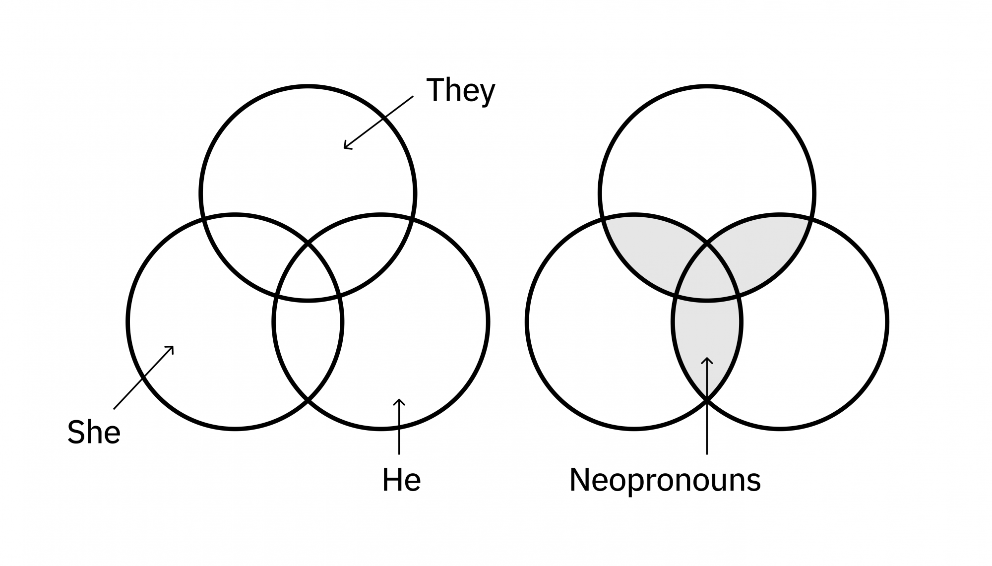
The icon is a three-circle Venn diagram, rotated in a manner so that there is one circle on top, and two below. Each circle represents the three most common pronouns; They/Them, She/Her, and He/Him.
The circle representing They/Them has been intentionally placed on the top. It’s a celebration of diversity and avoids a preference or priority to the most common gendered pronouns.
The section of overlapping circles creates a central triangular figure composed of three interlaced arcs. This is also known as a triquetra. I use it to represent the lesser-used pronouns that fall outside of the top three; known as neopronouns.
A personal pronoun icon

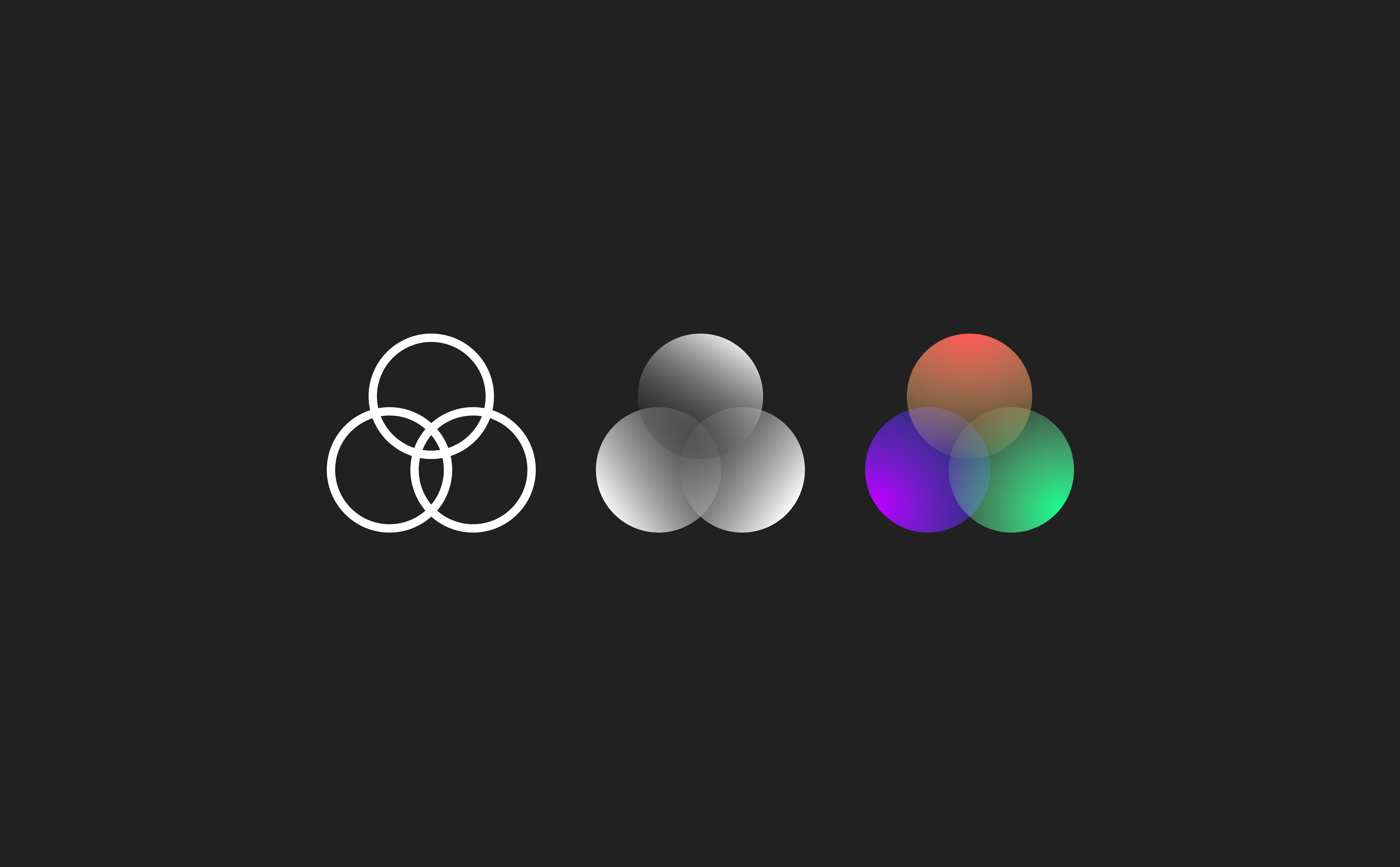
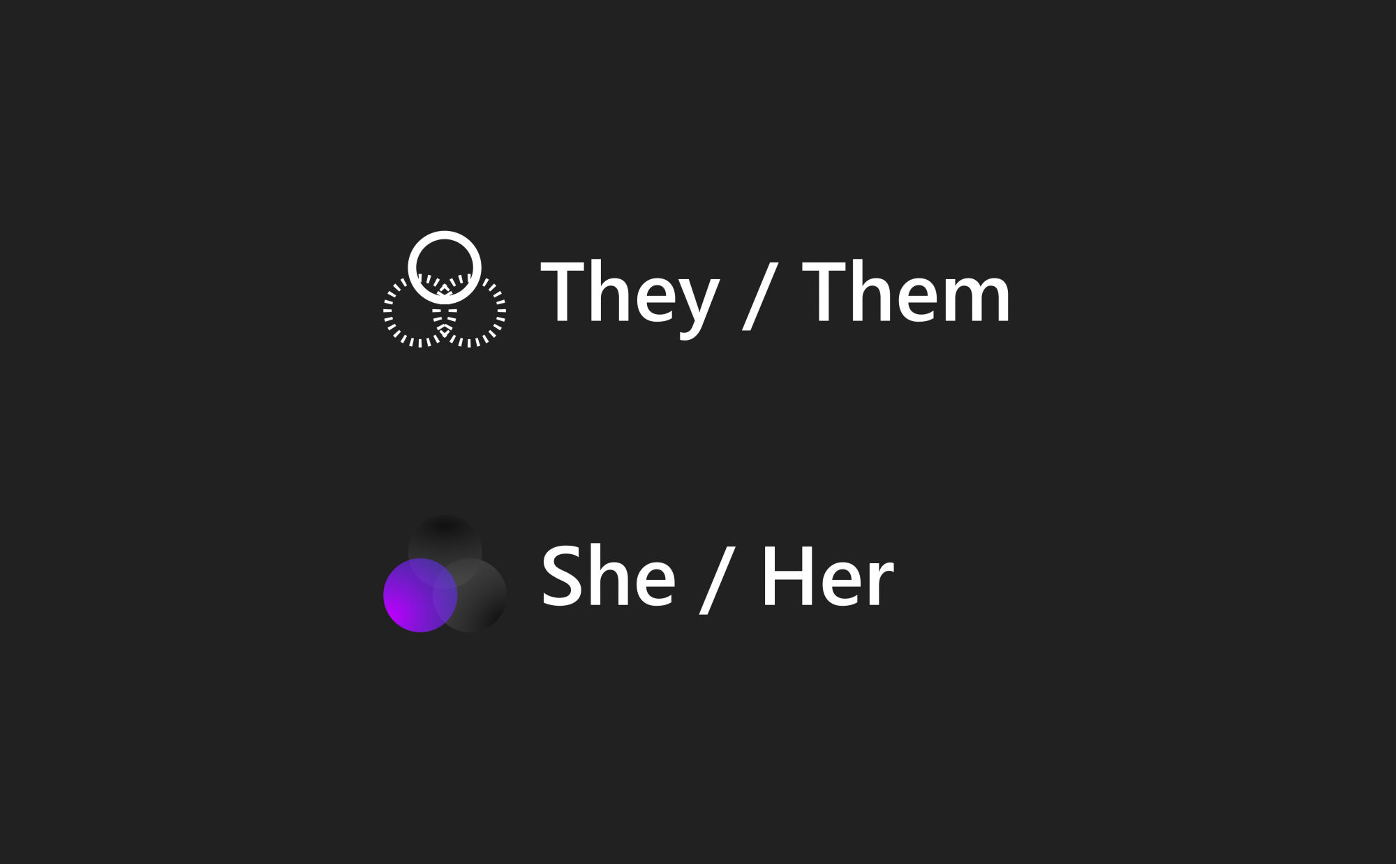
The pronoun icon also allows you to customise the symbol styling to visually present your pronouns at a glance.
By reducing and increasing the prominence of various parts of the symbol, it gives a glanceable insight into what a person’s pronouns might be once set:
pronouns.design
I went ahead and created pronouns.design which, over time, will be a set of guidelines and usage for an icon for pronouns.
The aim will be to offer a range of downloadable assets and guidelines to help people get started with implementing pronouns into their digital product, apps and websites, or print material.
I believe any good icon should work in black and white, outline and solid. It should work in flat colours and gradient colours. It should be able to work in almost colour, provided it meets colour contrast requirements, and by visible to the partially sighted.
All this requires some work and some tweaking over time. But for now, I’ve shared a first version one of the icon and the website.
Make the pronoun icon better
I would love to hear your feedback, so please leave your comments in the comments section below this post, or join the Matrix chat room #pronouns:gossip.land on Element.
Leave a Reply